
Your website is the face of your business. It’s critical that it looks professional, is easy to navigate, and speaks to your target audience.
The key goal of your site is to reach your audience, get them interested in its content, and finally lead to a conversion of a goal through website optimization. While that sounds easy on paper, the process of making this happen is actually quite complex.
Luckily at Reseau we have served plenty of customers with ranging goals and targets, so we sat down to compile a guide on how you can take your existing business website design, and convert it into a goal scoring machine.
Following this guide could sky rocket your conversion rates, so what are we waiting for! Let’s get into the 5 ways to optimise your business website design, and some optimization strategies.
Quick one too; if you are looking to use your website to sell services or goods, we have an article on how to help this:
1. Speak to your audience
Knowing your audience is critical in making your website work for you. A child’s learning centre and a law firm will have two completely different audiences, so it’s important to speak to their individual ideal customer. This is also one of the key ways to optimise your business website design!
When reading content, the user doesn’t want to feel over whelmed or intimidated by its language. At the same time, the user doesn’t want to feel under mined or patronised. This means you need to figure out exactly what sort of language and structure the content your users read uses. Best way to do this is through either audience research, or competator research.
Audience research can be quite complicated, time consuming and costly, as it involves gathering a large sample of your ideal audience and providing them with some form of questionnaire. This can allow you to narrow down how they speak, read and intake content.
However, we prefer using competitor research. What we usually do is visit a site of a business of similar niche to one we are creating content for. We copy all the content from their website into a word document, and process it through a word cloud website such as this one. This will generate an image with the most used words in their website, and will allow you to narrow down certain words to ensure you are speaking to your audience right.
2. Update your styling

Just like with speaking to your audience, the best way to upgrade and optimise your website is by refreshing its style. We see it time and time again, business websites cramming too much into their webpage causing the style to feel overwhelming and headache inducing. Here at Reseau, we recommend coming up with a Style guide and creating page templates based on this.
A style guide is a document that provides information about the visual branding, colour palette, typography, and other design elements for a company. We use these in order to provide uniformity in our website designs, as well as ensuring how we lay out and style the website fits with the brand and audience of the business.
The best way to optimise the style on your current website is to strip it down. Seems a bit counter intuitive, but bare with me!
Take a webpage on your current website, and screenshot it in full. We recommend using a full screenshot page plugin, to make this easy. Throw the image into an image editor of your choice, and just stare at the image for about 30-60 seconds. If any elements of the page burn into your retinas (not literally), that means they are overwhelming and distracting and should therefore be removed. If they are really important and crucial to the function or brand, we suggest either adding some transparency to them or making the colours less saturated.
3. Optimise your website for mobile responsiveness

Responsive website design is a technique that allows your website to be accessed by a variety of devices, from smartphones to tablets and desktop computers. It uses a combination of fluid layouts, flexible images, and media queries to create an optimal viewing experience for users.
Why care about mobile responsiveness?
There are a few reasons:
- Mobile traffic has surpassed desktop traffic in 2016
- The number of smartphone users is expected to grow by over 40% in the next four years
- Mobile-first designs are better for SEO because Google favours them in search engine rankings
While there is no swiss army knife for making pages mobile responsive, we always recommend going through your entire website on different mobile devices and making sure they look and function as they should. Biggest issues we see is elements being out of reach, images being too large or too small and text being the incorrect size.
This tip single handedly has boosted conversion rate for numerous customers of ours by an average of 20%.
We also highly recommend this article to see what other things impact your Google ranking: https://backlinko.com/google-ranking-factors
But if you are stuck in designing a good, mobile responsive website hero, we have a guide just for you:
4. Develop a funnel, and implement it
When it comes to conversion rates, the success of an online business hinges on how well it funnels visitors into potential clients. A CRO (conversion rate optimisation) plan should be developed for every website that needs to improve its conversion rates, and have a clear journey from visiting website for first time up to becoming a loyal client.
“But how can I optimize my website layout?”
This can best be done by developing a clear funnel. For example, say your goal is to get more newsletter sign ups. A quick funnel for this action could be below:
- On your home page, add a section about guides and free resources/articles
- Make sure each guide is full of information that is relevant to the audience of your newsletter
- At numerous break points of the article, include a sign up for your newsletter
- Provide a quick response action to sign up, sending a user an exclusive article or content piece
As a list, it’s super simple! But so often we work with new businesses that simply throw their content together and don’t plan how it can all link together in order to provide a solid customer journey. To implement this, go through your website and try to imagine how a customer might navigate it in order to go from the home page up to the action you want them to take (e.g. newsletter). Ensure that this journey is either the quickest it can be, or that it filters out people who might not be your ideal audience.
If you are stuck actually getting users through to your website, we also have a guide on how you can use some free tools to help with SEO:
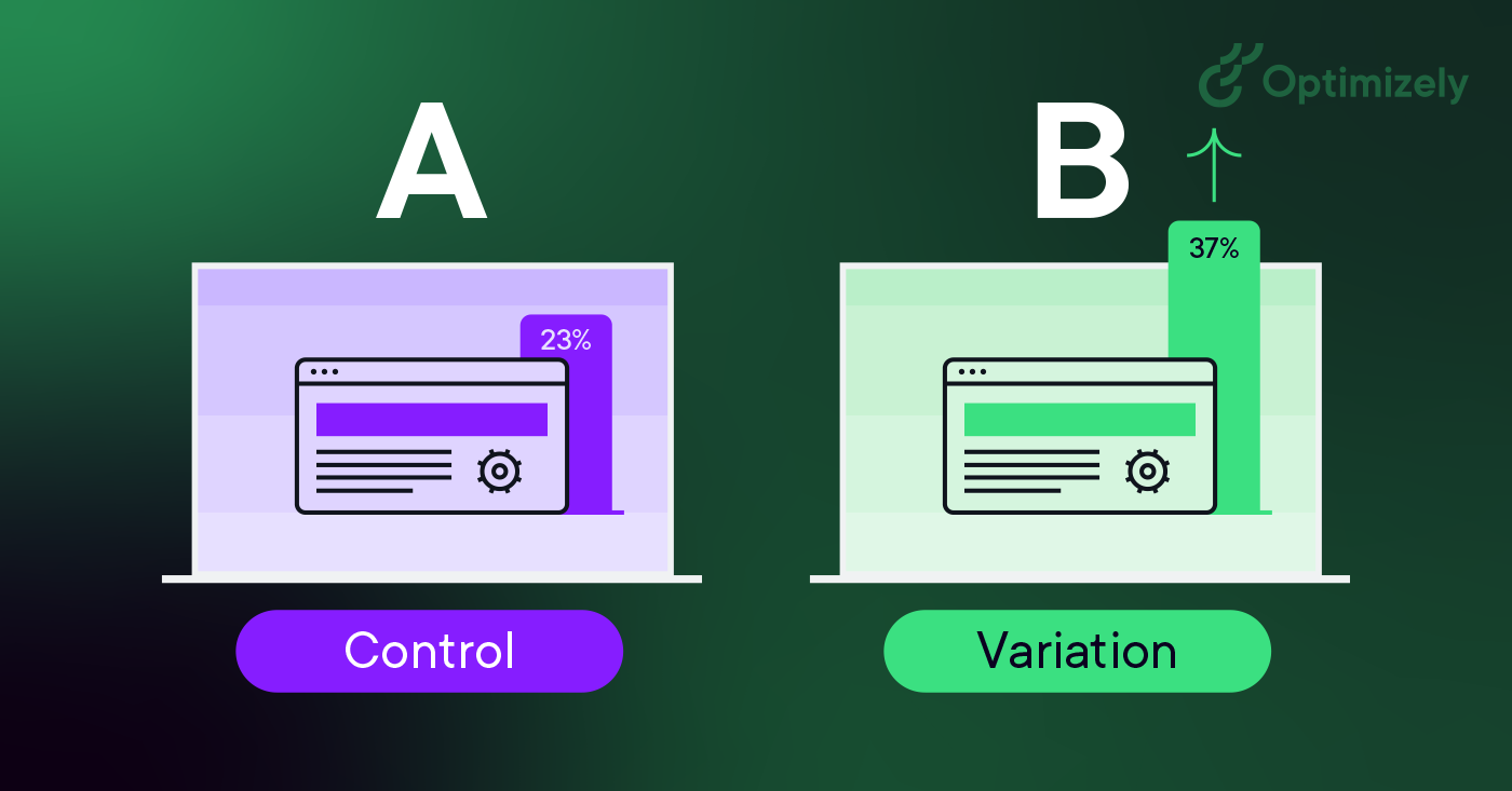
5. A/B test and measure KPIs
Okay, that is a complex headline. Let me quickly breakdown what the two things mentioned are:
A/B testing is having two or more different versions of the same page. For example, you might have 3 versions of a home page with 3 different layouts. You do this to split test which layout leads to the best outcome, measured by KPIs.
KPI stands for Key Performance Indicator. Essentially it means what are the desired outcomes or goals, and what will show that these outcomes have been achieved. An example of a KPI is conversion rate; if conversion rate increases, the performance has said to have improved and thus KPI has been reached.
With that out of the way, how can these two optimise your website?
If you already have a fantastic looking and feeling website, its worth to come up with some potential KPIs that you can strive for. When we created our new Reseau website, our biggest issue was bounce rate. We had lots of people visit our home or blog pages, and then leave straight after so we set that as out KPI.
By creating a few different layouts of our home page, we used Googles A/B testing system to then see which of the layouts creates the lowest possible bounce rate. Turned out, by not having all information about all out services straight at the top allowed users to explore the website more and not leave straight away.
We recommend you come up with a KPI for your business, then experiment with layouts/designs of pages to see how you can improve upon what’s already there. Make sure to A/B test, to make sure changes you make actually improve rather than hinder performance.
This method alone is one of, if not THE, best ways to optimise your business website design. If you do anything on this list, we recommend to be this!
If you are looking on how to design and structure your websites, we have an article that can help: