
Imagine this: you are getting 1,000 visitors a day to your website. Amazing! You have this massive number of people interested. However… your bounce rate is 95%. This means 950 of those people are leaving after just seeing your home page. That isn’t good!
Now what if I told you, the biggest reason people are leaving your website is your hero section? They go in curious, see your hero and straight away click off. Sounds extreme, but this does happen far more often than people think!
We want you to have a great website and we want to help you get that bounce rate down and keep your audience interested. So how do we do that?
In this article, we will cover 5 fundamentals for creating the perfect website hero that encourages visitors to explore, keeps your audience engaged, and doesn’t keep your visitors guessing what your website is about. Let’s get into it!
What is a hero section?

A hero page is the first section of a website your visitors see. It is the front line of your website and is usually the deciding factor between your visitors exploring further or clicking away.
Because it is the first thing people see, it is absolutely crucial to nail it and have an attractive hero that interests people and makes them want to find out more. The goal isn’t to answer all of your visitors’ questions, but to give them a reason why they should explore more on your website and find out more about you or your business.
Enough chit chat, how do we make your hero amazing?
5: Short, sharp, sweet
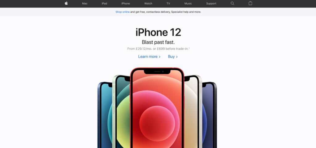
As my university lecturer said to me during software engineering lectures: you have got to remember K.I.S.S. Keep It Simple Stupid!
People do not want to be bombarded with essays and 4-page articles as they enter your website. They want to know a quick summary of what the website is about and why they should explore further.
Keep it super simple, create a short headline that resonates with your visitors and a short subheading to quickly explain what you do and catch their attention.
Always, and I mean ALWAYS, follow this with a call to action. Again, keep this simple. Direct your visitors with a simple “Shop Now” button or direct them to find out more about you with an “About Us” button. No matter what it is, always have a call to action.
4: Propose value
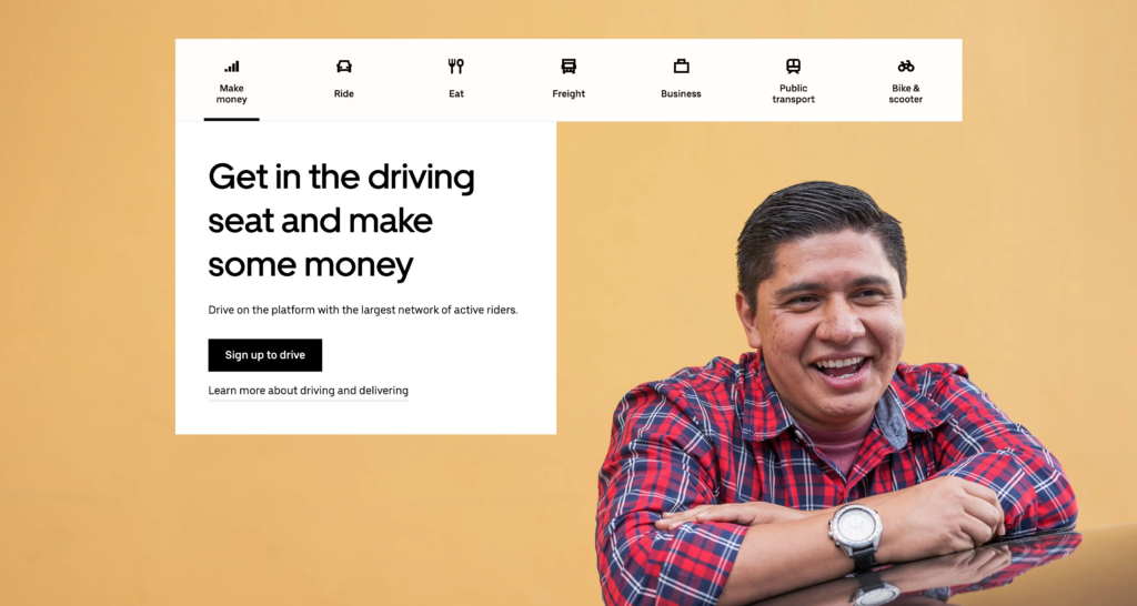
Just like with a store front or an advert, you have to give people a reason to go deeper. Take the above example of Uber: they are using a strong proposition of value which is making money!
Now imagine if this headline read:
“Looking for uber drivers”
Weak! Chances are, no one would really go ahead and see more information about this. The reason their hero is so successful is because they are offering a strong value to visitors which entices them to take action.
The value also follows the previous point of keeping it short, sharp and sweet. Uber aren’t describing a billion and one reasons you should become a driver for them, they just briefly mention that you can earn some money. Simple, and very interesting for their visitors.
3: Attention hierarchy
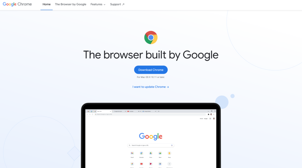
Have a look at the above hero section. Note down what you look at first. Where do your eyes travel after that? And after that? And after that?
There is a strong presence of attention hierarchy in this design. Google are trying to get you to look at this large image of the Chrome Browser which is what this page is for. It grabs attention and catches your eye easily.
After that, they use a big headline to explain a bit more. They explain the image in the headline, without giving too much away.
Right after that, there’s a big blue button as a call to action. That is the end goal of this attention hierarchy and it works perfectly.
So why is this so important? Why is this necessary to make an amazing hero section?
We want to make sure we grab the visitor’s attention with either a large catchy headline or like in Google’s case, a large image. This will appeal visually to people and intrigue them further. The goal is to then lead them through the different steps of curiosity into eventually taking action. This is done by giving them a sequence of steps to take. From the image to the headline, straight to action.
Without this hierarchy, your visitors will be very unlikely to take any action, as they don’t know what they are looking at! They don’t know where to look, where to go, or what to do, immediately turning them off away from your website.
2: Contrast
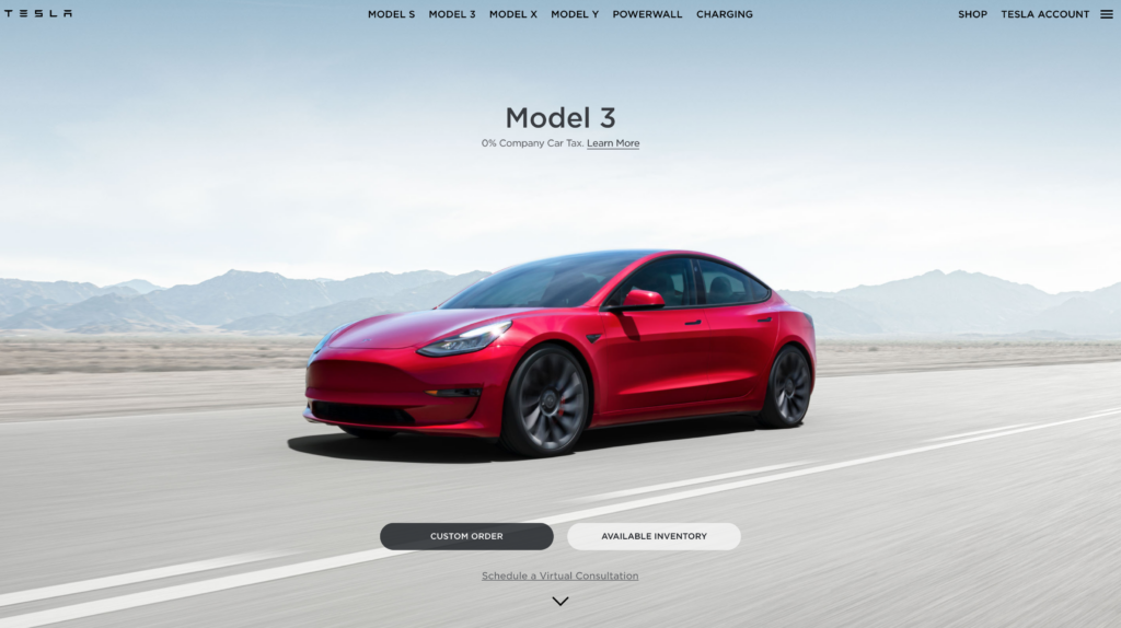
In our opinion, Tesla has the perfect hero section. There is one big reason why it appears so clean, so beautiful, yet so effective in grabbing your attention: contrast.
The light background makes the headline, subheadline, and more importantly, the car, stand out. The contrast between the car and all the other elements, make it stand out.
Contrast comes in various ways, including colour, size and brightness.
By making all elements a gentle and neutral colour, you can make your main image of your hero stand out significantly. Same with size; a large image will stand out loud and clear from smaller images surrounding it. These are the reasons people are likely to look exactly where you want them to and intrigue them to see more.
Not only that, but contrast is a great accessibility feature. If people aren’t able to read your text because of poor contrast, they will be turned off and more often than not, will move away from your page and never come back.
1: Answer the question: What is this?
When creating the perfect website hero, you have to give people the answers they are looking for.
Imagine your visitor just got dropped off at your website. They might have clicked on an ad or someone just sent the link to your page. Now what?
If they don’t get the answer to the question “what is this?” within the first 5 seconds of them being on the page, they will leave, no doubt about it.
You don’t have to give them an essay, again keep it short and simple! Summarise what it is you do, sell or offer. Give a quick digestion into what it is your website is for and make your call to action be the follow up to explore more.
Conclusion
It isn’t difficult to create a fantastic page hero, you just have to keep some basic fundamentals to create the perfect one! Keep it short and simple, create high contrast to create visual interest and answer the question: “what is this website?”
We hope this article gave you a good insight into creating perfect website hero section.
What do you think? Have you designed your hero sections with these fundamentals in mind? Are there any we missed?
Let us know in the comments below!